Tuesday 24 March 2015

Unit 205

List of equipment used including advantages and disadvantages.


Macro lens- The advantage of using a dedicated  Macro lens are that is offers closer minimum focusing distances and 1:1 reproduction ratios that other (in particular my 18-55mm ) lenses are not capable of.
The disadvantage- cost. Buying a dedicated macro lens is fairly expensive. 

Nikon DSLR Camera (D5300) - The advantage to using this camera over a compact is that you are able to use specialist lenses for a particular subject or effect you wish to produce also image quality is generally better. My camera was also able to shoot using the RAW format, this is useful for post shoot editing as there is no loss of image quality each time you open and edit an image.
Disadvantage- expense. A DSLR is an expensive piece of equipment. Added to this is the extra cost of the lenses you may wish to buy. 

Tripod- Using a  tripod provides a stable base for the camera, this in turn helps to eliminate camera shake. Slow shutter speeds are able to be used without the risk of blurring the image. The ability to use slower shutter speeds allows the use of smaller apertures creating a larger depth of field.
disadvantage- The high end tripods can cost a large amount of money. They can be bulky to carry especially when used out on location. They can present a hazard if people don't notice they are there, especially in crowded areas.

Desk Lamps-  The advantage of using a desk lamp are that they are relatively cheap, readably available.They are also directional which allows the user to direct the light to where they wish it to fall.
disadvantage- using normal bulbs causes the light to have a yellow tinge, daylight bulbs could be used but these are expensive.

Black/ White material- using black and white material was cheap as it was readily available. It produced a plain background against which my images could contrast.
disadvantage- shows up weave in close up photos, creases.

 Equipment I could have used.

Reflector-  The advantage of using a reflector are that it directs the light to where I want it which can cause some pleasing effects. It can help eliminate shadows.
disadvantage- quite bulky, more equipment to carry. 

Off camera flash- Being able to perfectly light your image to get the result you want is an advantage of using off camera flash, you don't have to rely on ambient light levels.The power of the flash can be changed depending on what effect you want.
Disadvantage- The power has to be changed manually which may cause you to miss a shot. It is more equipment to carry and quite expensive. The wires can pose a trip hazard. 

Remote Shutter- The advantage of using a remote shutter is that the camera can shoot an image without being touched. This is useful when taking pictures where you have to use a slow shutter speed as touching the camera can cause camera shake and blur the image. 
Disadvantage- Some remote shutters have to be pointed at the front of the camera where the wireless receiver is positioned, this can be a hindrance when you want to take the shot from behind the camera for instance wildlife photography.

Health and safety in photography.

When using any photography equipment, health and safety should be considered. Studio equipment should be handled with care, as it can be heavy and difficult to move into position, in particular, care should be taken when lifting it especially in relation to back health. All electrical cables should be carefully secured as not to pose a tripping risk. 

Studio lights should be used under supervision, they should never be left turned on when there is no one there as the bulbs can get extremely hot and pose a fire risk.

If I was to shoot on location and not in a studio, I should be aware that members of the public could be about and could easily trip over any equipment that I have set up. A full hazard assessment should take place before any location photography to foresee possible problems and to plan solutions to them. Also, full permission should be granted from owners/ managers to shoot on or in any private property. 

In relation to my project, I was using electric desk lamps in close proximity to a vase of water, I had to take special care not to let the vase get to close to the lamps in case I knocked it over as electricity and water do not mix!To reduce the risk of spilling I need to use a water container with a stable base. 

There is a risk that the desk lamp with a long electric cable which is not easily seen will be tripped over. I must warn others that this is there and position it where it will not cause a trip hazard. The wire should be taped to the floor where it is positioned where it could be stepped on.

I also used a tripod  which I set up in the spare room. I made sure to let the other members of the household know that it was there so they didn't trip over it.

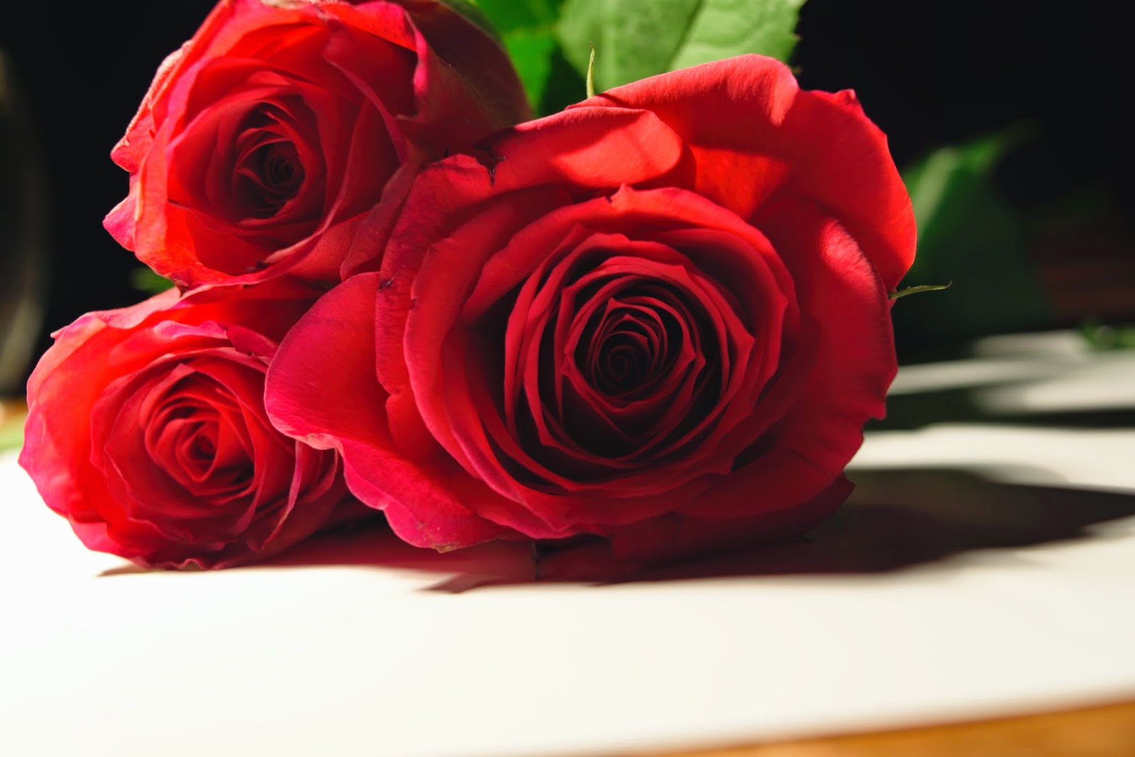
There is a risk that the cut flowers can host a variety of bacteria including Pseudomonas which can cause sickness to myself or others who contact them. I must wash my hands after handling them and instruct others to do so.

There is a risk of injury using sharp edges to prepare my flowers. I must take proper care when handling them and use scissors in preference to a knife.

 How to safely store, use and transport equipment.

All equipment when not in use should be stored safely out of the way as not to pose a tripping hazard. The camera itself should be stored in a padded bag with the lens removed and appropriate dust caps applied. You should take care not to subject the camera to extremes of temperature. Also keep the camera away from any magnetic fields as this can damage the mechanisms inside.

All lenses should have dust caps fitted when not in use. To avoid damage to the camera sensor, you should take care when changing the lens, especially in dusty environments. You should take care not to touch the glass as this can cause finger marks on the surface which will effect the quality of any image produced.

When changing the SD card, the camera should be turned off to reduce the risk of lost data/ corruption to the card. The card should be regularly formatted, especially if has been previously used in a different camera. 

When not in use the battery should  be removed in case of leakage which would damage the camera. A spare battery should be taken with you on location shoots in case it dies before you have all the images you wish to take. 

Software Available

Photoshop- To edit my final images for my project I used Photoshop CC. The main advantage of using Photoshop is the vast ways you can change your image. These include cropping, changing the colour of specific parts of the image, removing blemishes with the heal tool, altering the contrast and altering the exposure to name a few. Photoshop is also a useful tool for downloading and viewing your images.
The disadvantages of Photoshop is that is very expensive, however I took advantage of a free months trial to complete my project. Another disadvantage was actually using the program to create the effect I wanted.This was because I had no prior experience with Photoshop and I found it to be fairly confusing and time consuming. 

Materials Available. 

Photographic Paper

There are two main types of photographic paper- Matte and Glossy.

Matte Paper is dull and does not produce a bright vibrant image. The advantage of using matte paper is that finger marks on the surface do on show up, it also doesn't cause a glare from a light source. 

The disadvantage is that the paper soaks more ink into the paper effecting the quality of the image, this would be a problem when printing images that rely on small details.

Glossy paper produces smooth, shiny images which are vibrant and high in detail.

The disadvantage of using glossy paper is that any finger prints or dust can easily be seen if the photo is handled inappropriately. In this case the image should be framed.  There is also a glare from the image if you try to view the picture in bright light. 

In relation to my project I am presenting my images electronically in the form of this blog, however, if I wished to print the images I would choose the glossy paper as my images are high in detail and vibrantly coloured. 

I have chosen to present my images electronically as it is an affordable way to do it that, other than a computer, doesn't need any specialist equipment . It also allows anyone, anywhere in the world, to view my images depending on their internet access. All they need is a link to this blog. They could even accidentally find this blog when searching online. 


Evidence of Image Editing

For my project I had to alter the appearance of several of my images to present an image that I wanted. This was done by using Photoshop. I found it quite difficult to use this program as I had no previous experience with it. However, I feel my editing skills have improved.


I altered the Brightness/ Contrast on this image to make it stand out more.


The exposure of this image was altered to make the white in the image less highlighted.
I changed this image into black and white.
The majority of images were cropped to remove the unwanted background details and make the flower the subject.

Conclusion

I have enjoyed the challenges this project has provided and this has developed my photography skills.

I have followed a structured approach to producing a set of thematic images that form my project, titled A Study of Flowers and I have learnt how to perform research and to make and then execute a plan. My understanding of how different effects can be achieved through altering the aperture and shutter speed has improved.

Improvements I could make next time would be to the image capturing. If I was to do this project again I would plan to capture my images such that it would not be necessary to make so much use of Photoshop to make edits afterwards. Though better planning I would be able to avoid having to edit out unwanted background details.

I am now confidant to use a DSLR camera in manual mode settings, without relying on any automatic modes. This project has opened up many more opportunities for me to make use of my camera.

Final Ten Images


These are the final ten images that I have chosen for my project. I found it quite difficult to narrow my selection down to just ten but decided I wanted my selection to concentrate on the details of each flower. I have mainly adhered to this apart from image number 3 which I chose as I really liked the effect that changing the image into black and white had, it was also chosen as I admire the work of Imogen Cunningham and wanted to emulate her images.


Image Number One.
This image was chosen as it shows clear, close up details of the centre of the flower. the arrangement of petals around the centre portion gives movement to the piece, it is almost like the petals are reaching forward towards the viewer. The use of the macro lens enabled me to capture high levels of detail of the flower, including the specks of pollen.

Image Number Two.
I chose this image as again, it showed in high detail a small selection of the flower. The image conveys an almost velvety texture and was inspired by an image by the photographer Ron Van Dongan. the centre portion of the image looks "deep" this gives the impression of depth to the picture.

Image Number Three.
This image follows the Rule Of Thirds with the main subject being central. The line running through the central portion of the picture adds structure and stops the flower from appearing to float in mid air, the difference in tone of the background  adds to this effect. The flower is highly textured seemingly being smooth and delicate to spiky and stiff. The shadows to the right of the image work well, the image was not under exposed so the details are not lost. These shadows help to convey the sense of texture.

Image Number Four.
This image shows the effect of using a large aperture to create a shallow depth of field. The main subject of the picture (the flower to the right) could have been easily lost against the same shape and colour of the flower in the background if I had made this portion in focus too. As it is, the in focus flower seems to be bursting out towards the viewer creating a lot of visual interest and movement in the piece. 

Image Number Five.
I have chosen this image for the high level of detail in the centre portion of the flower. You can almost imagine how bumpy it would feel. The purple colouring that radiates out from the centre adds movement and is a nice contrast to the white. The use of a large aperture has created a blurred background, this directs focus to the main subject of the image.

Image Number Six.
I have chosen this image as it was inspired by a photograph by James Thornbrook ( the second to last picture in my research) In his image, only a small selection of the flower was in focus giving the effect that the flower was reaching out towards the viewer. I think this image conveys that technique quite well with only the bottom edge of the flower being in focus. The yellow tapering triangle in the centre of the flower also adds to this effect. The yellow also contrasts with the purple adding visual interest.

Image Number Seven.
I have chosen this image because of the vividity  of the colours. It is a bright and cheerful piece. There is also some bokeh effects in the background which add visual interest.

Image Number Eight.
I have chosen this image as it shows, in detail, all the parts of the flower. The image is well composed with the subject reaching diagonally from the bottom left to top right, this draws the eye up toward the top of the flower where the petals are arranged in interesting shapes. I also like the bottom half of the picture with the petal almost reaching out towards the viewer.

Image Number Nine.
This image was again inspired by the work of Ron Van Dongan and again the image conveys a sense of velvity texture. The way the petals are arranged in a spiral radiating out from the centre of the flower adds movement to the image.

Image Number Ten.
I have chosen this image for the abundance of texture present as well as the high level of detail in the centre portion of the flower which I feel adds visual interest. I am pleased with how the use of lighting has created a range of different tones from the fairly dark shadows in between the petals and the light tips of the same petals.


Monday 23 March 2015

Rejected Pictures

These are the pictures I have chosen not to be in the final selection of ten. I found it quite difficult to subjectively choose which ten should make up the final set of images, it was hard to base my decision not solely on which images I found to be pleasing, but ones in which fit into a theme and made up a harmonious set.


Viewed on its own, I think this is a vivid picture with an almost unreal quality with it's bright colours contrasting sharply against the grey background.However, for my project, I wanted my pictures to have a more realistic look. Technically, when editing this image in Photoshop, I think I could have selected the subject with more care by using the " refine edge" tool.


This image seems much too cluttered, there is too much going on in the picture. I could have cropped more of the image or used a shallower depth of field so only one part of the image becomes the main focus. 


The grey colour causes this image to be much too "flat" It is a boring, almost depressing picture and doesn't fit the vibrant theme that I wish to produce for my final set of ten images.


I love the lighting in this image, however the flower at the front is out of focus and, being the main part of the image, it is a distraction. This image may have worked is there was less of the front flower in shot, it would have provided depth to the picture without being a distraction.


I tried the technique of "colour popping" for this image as I was inspired by several images I found on line while researching photo shopping techniques.  The way the flower lies horizontally across the picture gives the image a sense of depth. This image was almost chosen for the final ten but I wanted to concentrate more on the close up detail.

Again, this image was almost chosen for the final ten but wasn't chosen for the same reasons as above.

This image has been badly edited in Photoshop, I could have improved this image by using the refine edge tool to make the selection around the flowers smoother. I also think the grey background does not work well against the yellow flowers and in particular the green leaves.
While I quite like the composition of this image, I wanted my final ten images to focus solely on the flowers. The vase in this image is a distraction, as is the two colour background.
I think the composition of this image works well, however, I intended my images to show more detail of the actual flower. I could have improved this image by cropping most of the stem out.
This image is badly composed and the detail of each flower seems lost in all that white! I could have improved this image by using a black background to provide a contrast with the white flower/
The composition of the image is fine, however, I had to be quite choosy with my final images and this one didn't quite make the cut. The green of the stem against the purple is a distraction, I could have used Photoshop to cut this part out.  


Monday 23 February 2015

Short List of Photographs After Editing.

After choosing from the three photo shoots a selection of photographs that I thought had most potential, I edited, where I deemed necessary, each one using Photoshop. I found this to be quite a difficult task as I had not had much experience with Photoshop. I also struggled to decide in what direction I wished to take the image. For inspiration, I looked again at the work of the photographers that I researched. When I wanted to use a certain technique on the picture, I would look for instructional videos on YouTube. I found this to be very helpful.

These are the short list of photographs after editing, it is from this selection that I will choose my final ten images.


Sunday 22 February 2015

Short List of Photographs for My Final Ten Images.

From the three photo shoots, these are the images that I believe to have the most potential. I have chosen ones which I feel are most inspired by the photographers that I researched. While they are not exact copies, they do, to me, have some similarities. This will be explored further with my ten final images.

I plan on using Photoshop, where I think it necessary, to edit each photograph. This editing will be as straight forward as cropping the image or making the image black and white to something fairly difficult as changing the background colour while keeping the image the same.